Analyzing 66mm New York City Uber Pickups
What the data says about how the service has done in the city and how New Yorkers use it
The New York City Taxi & Limousine Commission requires that Uber and other "For Hire Vehicles" report certain information about each pickup (don't worry, it's nothing specific). Every so often the NYC TLC releases a new batch of information on their website. So what does the data tell us about how New Yorkers use Uber?
First a bit about the data and process. I focused only on Manhattan since that's where I used to live and I wanted a trimmed data set for a separate post. I also modified the raw data to include some additional useful info. All told this gives us 66 million Uber pickups in Manhattan to examine.
Now then, how is Uber doing in Manhattan? Not too shabby. Pickups in Manhattan just broke the one million per week mark in the last two months of 2016. Before then, it looks like growth leveled off at the start of 2016 before resuming in the second half of the year. The chart below plots the weekly number of rides over time.
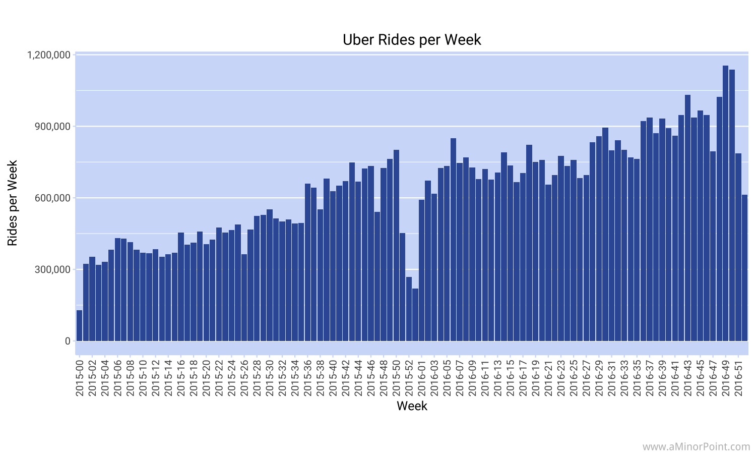
Perhaps not unexpectedly, there are big dips in the data around the holiday season. It seems the number of New Yorkers that leave the city at year end exceeds the number of visitors coming in, at least in terms of those that use Uber. Winter break from school may also play a role in families going on vacation in a concentrated period.
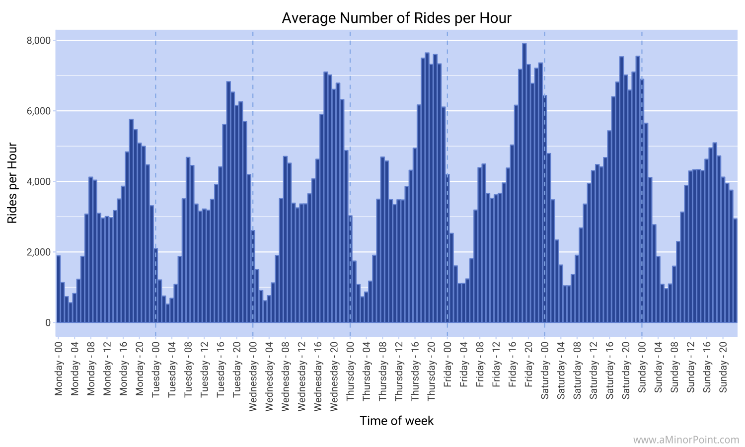
So that's nice to see, but what about how people use Uber during the week? First we have to differentiate between a weekday and the weekend. A typical weekday sees a usage spike during the morning commute which peaks during the 8am and 9am hours. Then usage tapers off during the middle of the day before picking up again into the evening commute. During most days peak usage is during the 6pm hour.
While usage quickly declines on Monday and Tuesday, starting on Wednesday, usage stays high later into the evening. This probably reflects more people going out for work events or meeting friends for dinner or drinks as the work week winds down.
You can also see that social calendar reflected from Friday evening into Saturday morning and from Saturday evening into Sunday morning. Sundays appear much quieter as people presumably take it easy before starting the work week.
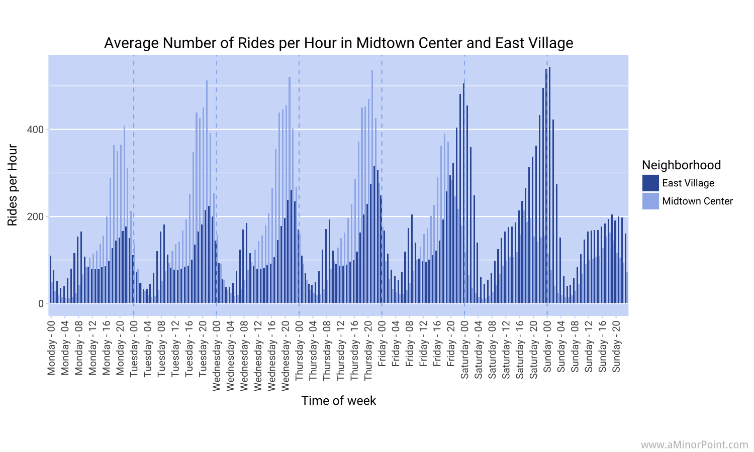
The previous chart masks some significant differences by neighborhood. The chart below shows Uber usage in what the NYC TLC calls "Midtown Center" which stretches from 42nd St to 54th St and from Park Ave to 6th Ave. It's actually the second busiest area in 2015 and 2016 with just under 2.67mm pickups during that period.
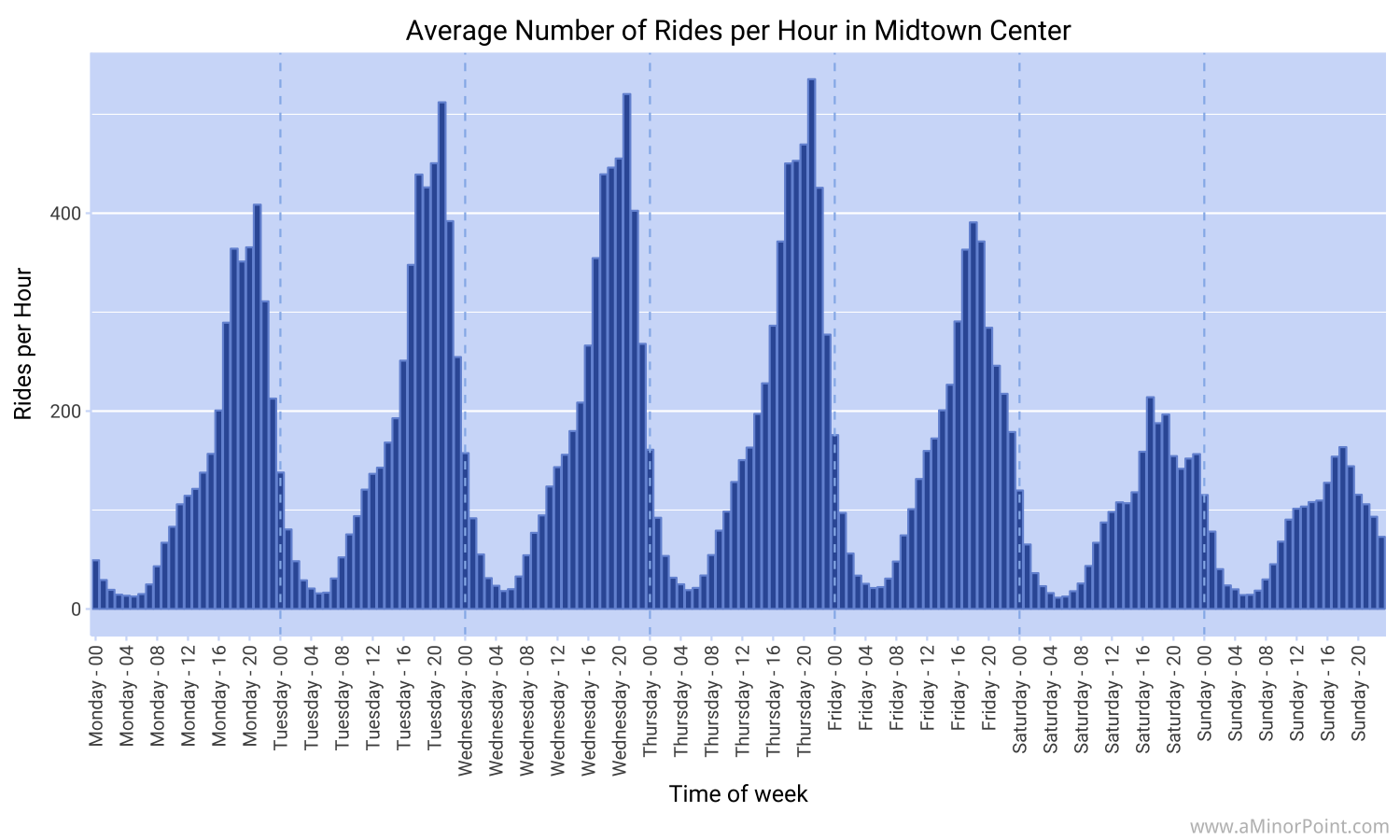
As expected, pickups are concentrated during the workweek in the evening with significantly fewer pickups during the weekend since , well... not many people live in that area.
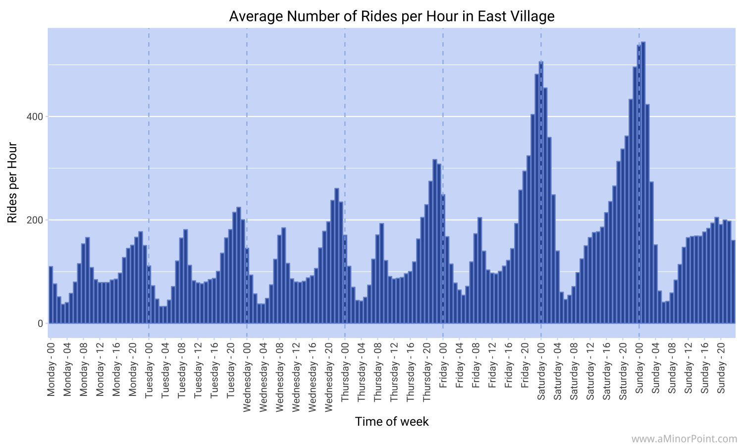
The busiest area during 2015 and 2016 was the East Village with just under 2.71mm pickups. But it's not just due to people heading home from the restaurants and bars. There's also a spike in the morning commute.
We can combine two busiest neighborhoods into a single chart to get a clearer picture of the differences.
What about growth?
We saw earlier that there's been some significant growth in Uber usage. The first few weeks of 2015 averaged around 300k rides per week. The last few weeks in 2016 saw the average jump to around 900k rides per week with a few punches above the 1mm mark. If we compare the last two months of 2016 to the last two months of 2015, Uber usage in Manhattan increased by approximately 43%.
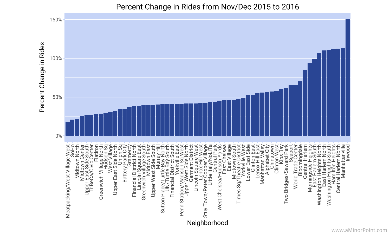
The distribution around that average is pretty wide. The chart below breaks down the growth rate by neighborhood. Notably, the areas showing the greatest percentage increase are concentrated in Harlem, Morningside Heights, and Inwood.
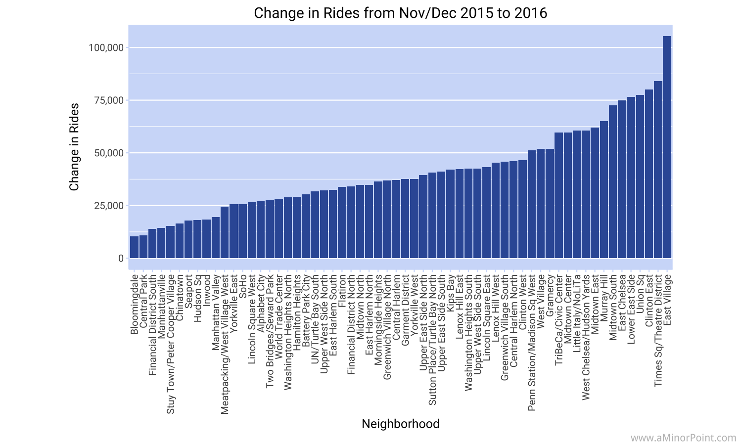
The chart below shows the increase in the number of rides.
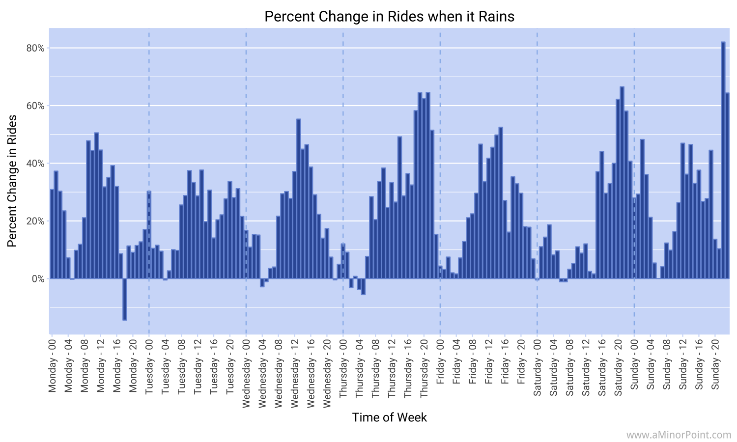
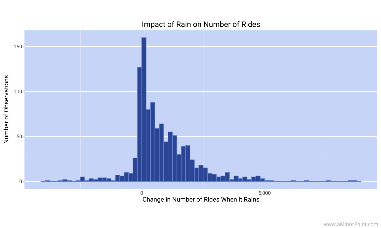
What happens when it rains?
My theory was that when it rains, demand for Uber increases (a real original thought, I know). But I was surprised at how much of an impact it has.
There is a weather station in Central Park. Every hour (well, except for bad readings) a data point is created noting the temperature, wind speed, precipitation over the past hour, etc... We can combine that data with information about Uber pickups to get an idea about how behavior changes when it rains.
Now ideally there would be weather readings from each neighborhood so that we could make very refined comparisons. But I haven't found that data so Central Park will have to do as a proxy for all of Manhattan. I know it'll sometimes be raining in midtown and sunny in the financial district, but it's the best we've got at the moment.
A quick note on the methodology: Every time there was an hour when it rained, I compared the number of rides to the prior week and to the following week. I chose this approach to try and account for the increasing usage of Uber over time. This way, we're not comparing a rainy Tuesday in February of 2015 to a rainy Tuesday in November of 2016 and ignoring that overall ridership more than doubled. Of note, there were 1,073 examples of when it rained, which is about 6.5% of the time. This includes 459 times when it barely rained (less than 0.02 inches in the past hour). The maximum number of data points for a single period was 13. So not the greatest...
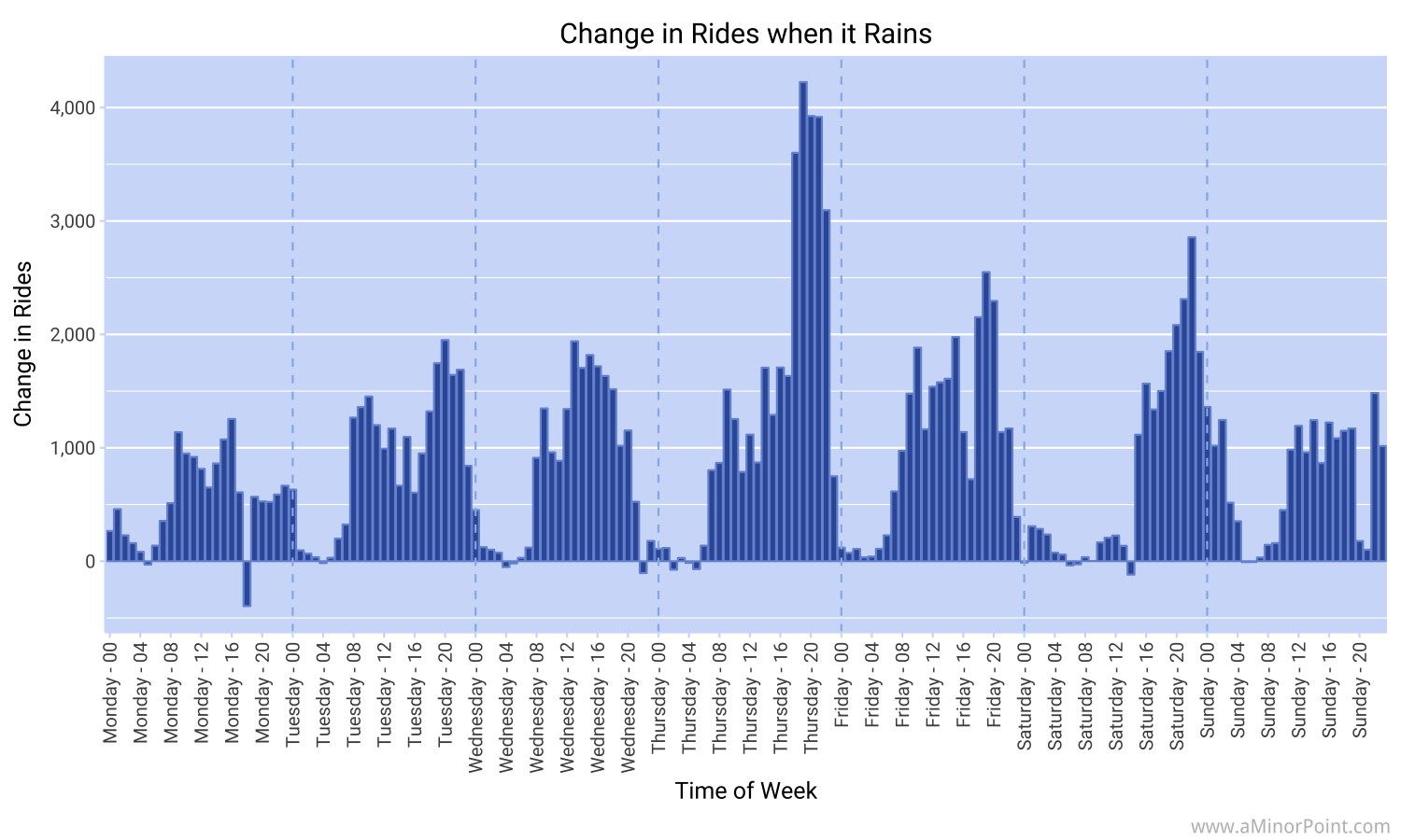
The histogram below shows the impact of rain on ridership. On average, 835 more rides were taken when it rained.
We can get a bit more granular and see the impact by day of the week and hour of the day, as before.
Finally, we can also calculate the changes in ridership as a percentage of the average pickups. This is very noisy because again, there are only a handful of data points for each period.