Understanding and contextualizing manufacturing employment
Mapping where the jobs are and how that's changed over time
Manufacturing jobs always seem to be in the spotlight. Whether it’s on the campaign trail, a policy objective of the government, or angst from the threat by automation and robots, it never seems very far from public discussion. But how many people currently work in manufacturing? Where’s it concentrated? How has it changed over time?
That’s the point of this post. An informed discussion has to include an understanding of how manufacturing jobs have evolved over time and where they’re geographically located. Perhaps we can dispel some common perceptions along the way.
Evolution of manufacturing employment
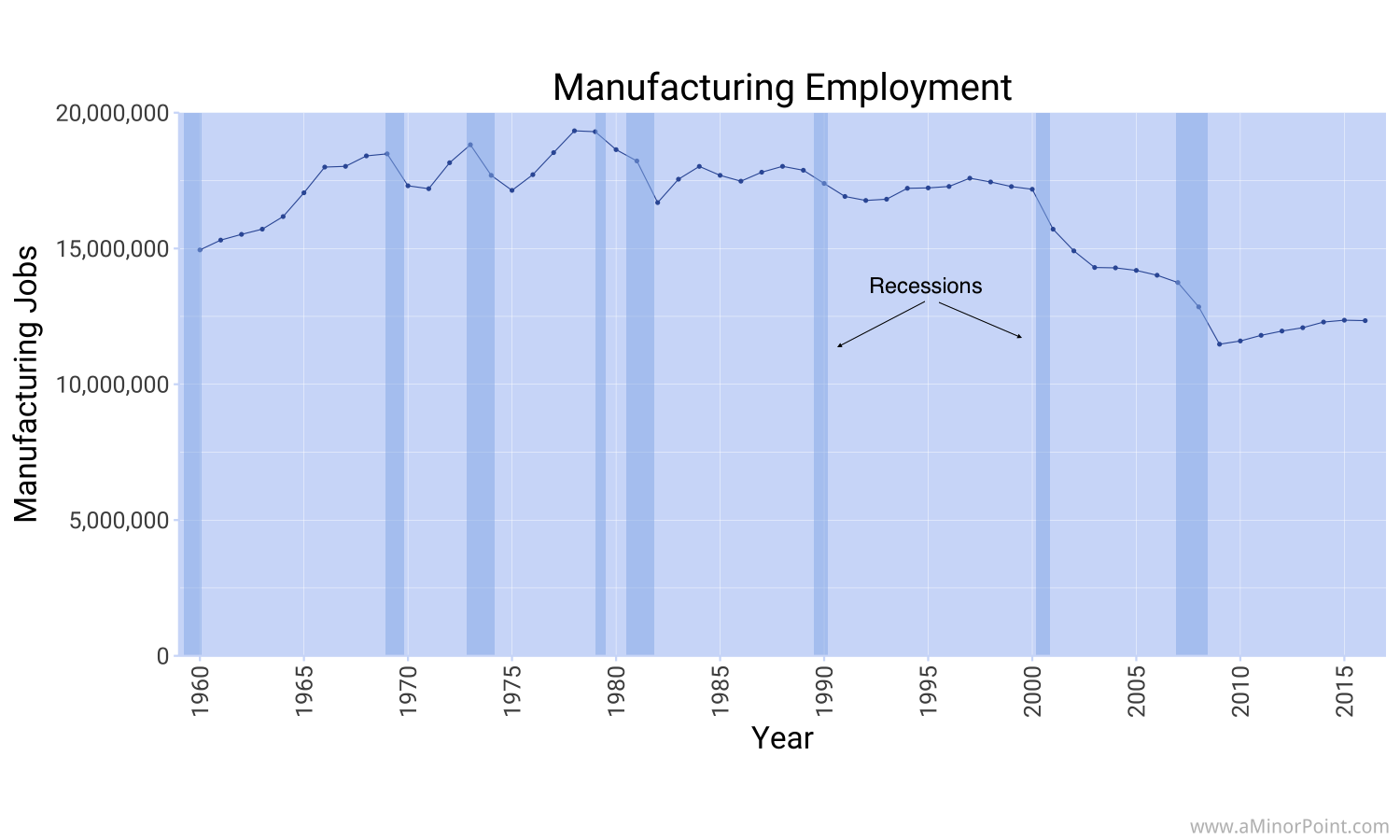
Let’s start with looking at the number of workers employed in manufacturing. On an annual basis, manufacturing employment peaked at just over 19.3 million in 1978. After the subsequent two recessions, manufacturing employment hovered around 17.5 million for the next two decades. Even back then, there wasn’t much growth in manufacturing jobs!
However following the 2001 recession, manufacturing declined sharply to around 14.0 million jobs where it remained until the Great Recession. Just two years later manufacturing employment dropped to just under 11.5 million. Since then it has risen, slowly, to 12.3 million jobs at the end of 2016.
Where are the manufacturing jobs located?
So now we know what the overall trend looks like. But where are those jobs located? You wouldn’t know it based on the public discussion, but California actually has 1.3 million people working in manufacturing, more than any other state. Texas is number two at 840 thousand people. That’s almost as much as Ohio, Michigan, Illinois, and Pennsylvania combined!
To be fair, California and Texas are the two most populous states. Another way to think about it is to look at the number of people working in manufacturing as a percentage of the working age population. That way we can normalize for population. On that metric, California and Texas drop to the bottom half of states. The state that has the highest share of workers in manufacturing? Wisconsin. That’s followed up by Indiana, Iowa, Michigan, and Ohio, some of the traditional Rust Belt states.
But even then, only 12.1% of working age people in Wisconsin work in manufacturing.
You can explore the map below to look at the history of where jobs were, both by state and county. The years were chosen to correspond to periods just prior to or at the beginning of recessions.
Looking at the changes in manufacturing employment
Now we have some idea of where manufacturing jobs are now (and back at various points in time). But how about looking at the changes in manufacturing employment?
A few states actually saw increases in manufacturing employment since 1990. Utah, Nevada, and Idaho put up modest gains. California saw the steepest declines, losing 730,000 jobs between 1990 and 2016, followed by New York, Pennsylvania, and Ohio.
The map below lets you explore those changes. A quick note: “Change in ratio” refers to the change in the percentage of people working in manufacturing over time.
What about other types of jobs?
So now that we’ve got a better idea of how manufacturing jobs evolved over time and across the US, what about other jobs?
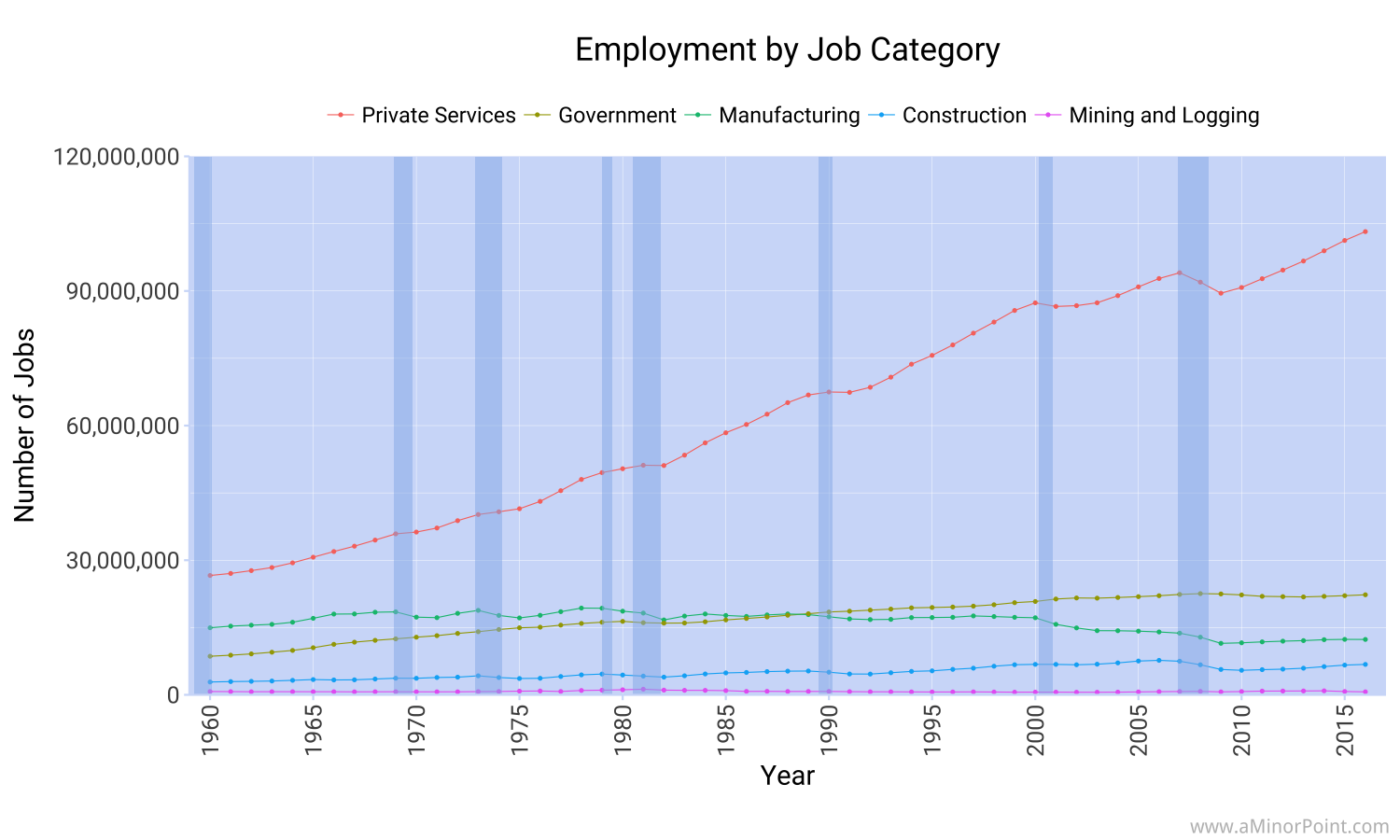
Broadly speaking, jobs are classified as “goods-producing”, “private service-providing”, and “government”. There are several subcategories within each of those classifications. Manufacturing jobs fall under “goods producing” jobs, along with mining jobs and construction jobs.
While the number of people employed in manufacturing has been declining, the number of people employed in service jobs has been growing. Service employment stood at 103 million at the end of 2016, over EIGHT times as much as manufacturing employment.
That’s not meant to minimize the impact of job losses in manufacturing. But it is meant to provide perspective. Focusing solely on one sector of employment misses the forest for the trees and ignores the sectors where the vast majority of Americans work.
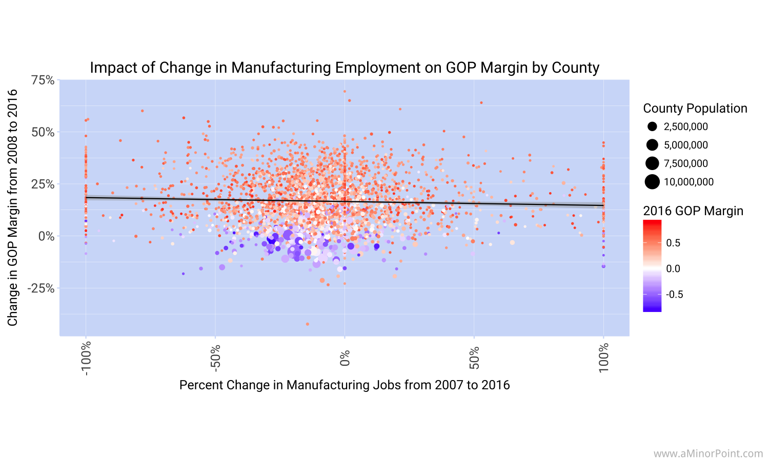
Did changes in manufacturing employment impact the last Presidential election?
Based on what's reported in the press you would think it was a key factor. But when looking at the results by county, there doesn’t seem to be a meaningful relationship between the percentage change in manufacturing jobs from 2007 through 2016 and the change in margin for the Republican party from the 2008 election to the 2016 election.
When running a simple regression, the indicated beta is -0.013. In other words, for every 1% decrease in manufacturing jobs, the Republican margin increases by 0.013%. So if all the manufacturing jobs were lost in a county, the Republican margin should have increased by 1.3%.
However, the data is very noisy and there are obviously other factors at play. The R2 is 0.002, not exactly useful on its own.
It’s also worth mentioning that this looks at all counties individually, and that’s not how the election is decided. In states that were close, the impact may be more pronounced.
The data for the county results can be found here.