How long does it take to drive to LaGuardia, JFK, and Newark airport? What the data says.
Breaking down average travel time and cost by neighborhood.
I used to live in New York City near Columbus Circle and worked in Midtown East. I ended up using all three airports and began to develop intuitive rules of thumb. For instance, if I was traveling out of LaGuardia and leaving from work in the afternoon, I would usually take a cab since I was already near the Queensboro Bridge. If I was leaving from home instead, I would take the subway and bus, since it would sometimes take me 20+ minutes just to travel the one mile across town to the Queensboro Bridge.
Even though I don't live there anymore I wanted to figure out, on average, how long it takes to reach each airport and how much it typically costs based on the day of the week and the time of day. Sometimes taking the subway, bus, or PATH will be quicker, but sometimes if there's a lot of luggage involved, it's not the desired method. The calculations are based on 4.7 million taxi trips during 2015 and 2016. Check out the maps below to explore the data on your own.
Quick summary
A few conclusions from the data:
From the west side of Manhattan and below Central Park, Newark is almost always the shortest trip.
Newark is always the most expensive airport to get to, primarily due to the $17 surcharge.
For parts of Brooklyn (Brooklyn Heights, DUMBO, etc...), it takes just as long to get to Newark as JFK.
Newarks is surprisingly (to me) competitive. If you're catching a ride from west of 5th Ave or south of 14th St, it's on average quicker to get to Newark than JFK, though it will cost more.
Mapping the most advantageous airport
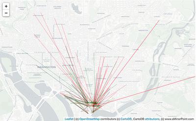
The first map displays the relative advantage between the airports by neighborhood. For example, by selecting "closest airport", you will present a map where the color indicates which airport is closest, while the darkness of that color indicates its advantage relative to the next closest airport. The same methodology holds for comparing fares. If you hover over a neighborhood, you can see the underlying data to each airport.
Mapping the data per airport
The second map displays data based on a single airport. For example, selecting "Travel time" will shade the map based on how long it takes to reach the selected airport. The same methodology holds for fares.
More about the maps and data
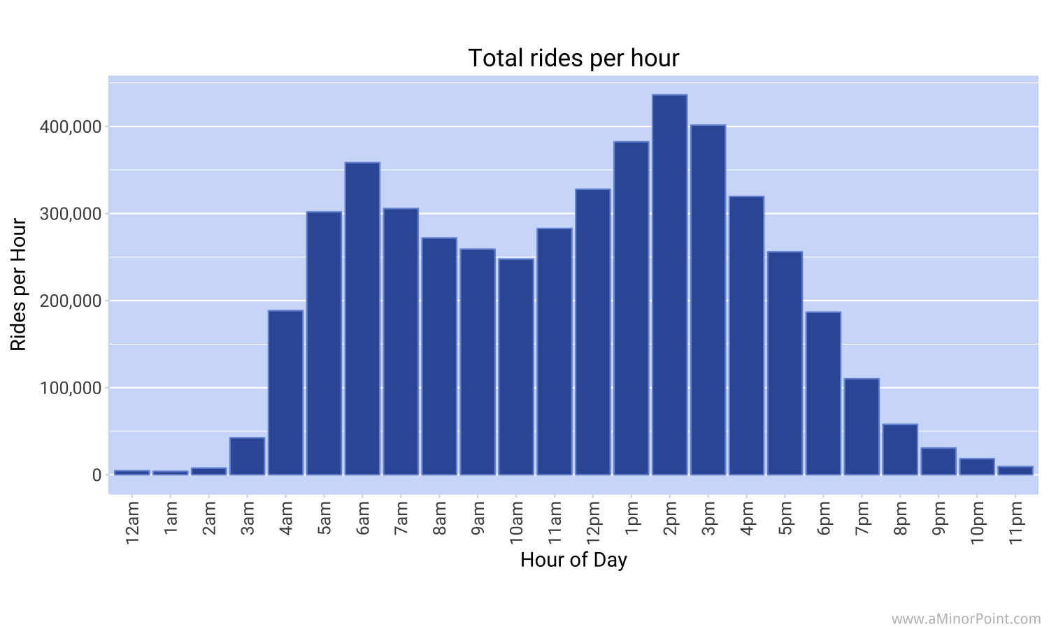
You may be wondering why I chose those time groupings. The chart below lays out the total rides over the sample period by hour of the day. Interestingly, the peak in rides is before the typical rush hour. This makes some sense as flights typically leave early in the morning during rush hour and typically right after rush hour in the evening. It may also reflect travelers trying to beat rush hour traffic.
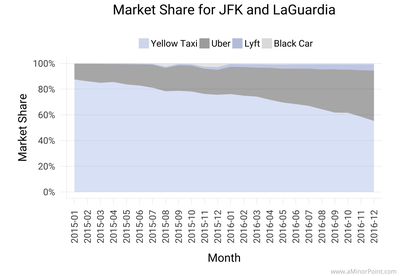
If you want to see how ride sharing services are doing against taxis from the New York City airports, check out this post.