a Minor Point
  • Contact
  • About


How We Get Around and the Implications for Autonomous Vehicles

An introductory look at the high level strategic considerations for autonomous vehicle adoption

In the short term, autonomous vehicle technology has a place in dense urban areas where ridesharing is already desirable by consumers and viable for providers. In the medium to long term, there is also a significant market opportunity in providing the technology as a feature for personally-owned vehicles of consumers in less dense areas.


Scooters in Washington DC Part 2 - Characteristics of areas that have high scooter usage

Leveraging geospatial scooter data and public land records to identify high-usage areas for improved scooter placement

By combining scooter data with publicly-available tax lot and property record data, areas of above-average usage are identified. Hotels generated the highest usage, followed significantly behind by office areas. Dense residential with property assessments in the $400k-$600k followed in third.


Economic trajectory of coronavirus impact

Assessing the share of global GDP in worsening, transitioning, and improving situations

Using case data from Johns Hopkins University and GDP data from the IMF, we can get a sense of what share of the global economy is experiencing a worsening coronavirus situation, experiencing an improving situation, or in a transition phase.


Scooters in Washington DC Part 1 - Estimated market share and utilization rates

Using 400 million data points to analyze the scooter market

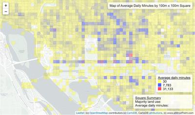
During November and December 2019, riders used e-scooters and e-bikes for an estimated today of 7.7 million minutes across the eight providers. This translates to an estimated utilization rate of 1-4% across Jump, Lime, Bolt, Spin, and Skip. Read more to see the highest scooter utilization rate and how riders used scooters around Game 5 of the World Series.


Corporate income taxes - How much are they and what do companies do with what's left after paying them

Using IRS, Treasury, Federal Reserve, and BEA data to understand corporate taxes in the US

Federal corporate income taxes generate around $300 billion a year in government revenue. But the impact is uneven between companies. About 0.14% of companies pay about 87% of corporate income taxes. Those same companies spend around $1.7 trillion each year on capital investment and another $1.5 trillion on dividends and share repurchases. From this starting point, a cut in the corporate tax rate will by definition predominantly benefit large companies doing more than $250 million per year in revenue, while small businesses won't see much of an impact since they do not pay a significant amount of corporate income tax to begin with.


Exploring Small Business Employment

Using statistics from the Census Bureau to better understand small business employment growth by state and industry across the US

Small business employment has recovered since the Great Recession, though it continues to decline as a share of overall employment. Using data from the Census Bureau, we can explore which states have done relatively well and which ones have lagged, along with the industries where small business employment growth was strongest.


Uber on the Verge of Overtaking Taxis in New York City - A Look at Trip Data Through June 2017

Uber and Lyft together already surpass yellow and green taxis

Recently released trip data from the New York City Taxi and Limousine Commission allows for an updated analysis of trip statistics through June 2017. The data shows the ride-hailing companies have been a boon for people living in the outer boroughs while also helping to grow the market in Manhattan.


Estimating Amazon Prime Air's Cargo Volumes

Using Department of Transportation statistics to estimate Amazon's impact on the US air freight industry

Since announcing the air cargo operation in May 2016 Amazon Prime air has been adding aircraft to the tune of 24 by the end of Q2 2017, with a target of 40 aircraft by the end of 2018. Using DoT air freight data for the companies operating the Prime Air flights, we can estimate how much volume Amazon's planes are carrying and estimate their share of total US air freight.


US Airline Passenger Statistics Mapped

Visualizing airline routes weighted by passenger counts in 2016

Using data from the DoT's Bureau of Transportation Statistics we can add a new twist to traditional airline route maps. With this data, we can produce route maps weighted by the number of passengers that fly each route to create a more informative visualization of airline route networks. The data also allows for viewing the routes by airport, in addition to by airline.


Should taxis wait at the airport for their next fare? What the data from O'Hare says

Using taxi trip data to determine how to maximize fares and tips after dropping off a passenger at O'Hare

In 2016 there were over 390,000 taxi trips to O'Hare Airport from the Chicago area. After dropping off their passengers, not all drivers waited in the long queue to pickup a new passenger at the airport. This provides an opportunity to investigate whether waiting or leaving the airport is the best strategy to maximize revenue and tips.


The decline of manufacturing in the US... wait, what decline?

Looking at manufacturing output and efficiency over the last twenty years

Since 1997 manufacturing output as measured by real value added has increased 40%. While it decreased sharply during the Great Recession, output has almost recovered to that previous peak. But what hasn't recovered is manufacturing employment. The rebound in output has been accompanied by a pick up in efficiency, and the industries where output is growing the most happen to be some of the most efficient manufacturing industries. So while employment has declined, manufacturing in terms of output is doing ok, though there's significant variation at an industry level.


How long does it take to drive to LaGuardia, JFK, and Newark airport? What the data says.

Breaking down average travel time and cost by neighborhood.

Using data based on 4.7 million trips to the three airports, we can figure out, on average, which airport is quickest or cheapest to get to when driving. The info is broken down by neighborhood and by time of day for you to pick and choose what you want to see.


How Currency Intervention and Manipulation Works

Looking at Saudi Arabia, Switzerland, and China to understand currency manipulation

Currency manipulation can be a complicated concept to grasp for those that haven't worked in finance or economics. Here we try and walk through the basics so that you can better understand the discussions that pop up in the press every so often. A few recent examples are used to illustrate the basics and give some background on the topic.


Understanding and contextualizing manufacturing employment

Mapping where the jobs are and how that's changed over time

Manufacturing employment has been a focal point of policy discussions of late. In this post, we can explore where those jobs are located and how they've evolved over time, and potentially tear down some misconceptions. We can also investigate what, if any, changes in manufacturing employment had on the 2016 election.


Taxis vs Ride Sharing at New York City Airports

Analyzing ride data for taxis, Uber, Lyft, and others, at LaGuardia and JFK to see how the market has evolved

From 2014 to 2016 over 23 million people took a car from LaGuardia and JFK to their final destinations. Over this period, the growth of ride sharing, particularly Uber, has been staggering. But that hasn't necessarily been at the expense of taxis as the overall market has been growing at the same time.


Mapping Uber Demand in Manhattan

See where the demand is likely to be based on 66mm Uber pickups

Based on two years of data on Uber pickups, the tool allows you to visually see where the busiest and quietest neighborhoods are likely to be based on the day of the week, time of day, temperature, and whether or not it's raining.


Analyzing 66mm New York City Uber Pickups

What the data says about how the service has done in the city and how New Yorkers use it

From January 2015 through December 2016 there were 66mm Uber pickups in Manhattan. Growth has been explosive over that period, starting from about 300k rides per week at the beginning of 2015 and just starting to breach the 1mm rides per week mark at the end of 2016. Within that growth we can explore what the daily ridership patterns look like, where that growth is most concentrated, and how weather impacts usage.

Copyright © 2020